• For users coming over from tmlfans.ca your username will remain the same but you will need to use the password reset feature (check your spam folder) on the login page in order to set your password. If you encounter issues, email Rick couchmanrick@gmail.com

Leafs unveil their Reverse Retro jersey

herman said:
Meh

Edit: now veering into bleh

Yeah I'm not a big fan. Don't really care for that logo but I guess the Leafs are already basically using the retro logo that I do like so I get why they wanted to go for a different one.
Then again it feels like 90% of these reverse retro jerseys blow so at least the Leafs don't have the worst one.
 
I get doing this to try and sell some merch but that is one of my absolute least favourite Leafs' looks.
 
These are probably the only good ones:
Em89YxZW4AApYKn

Em89crHXEAAeARK

Em89pc7XMAEn3kb


I copy and pasted 5 img codes before going through the logos and picking the good ones and I couldn't even use them all.
 
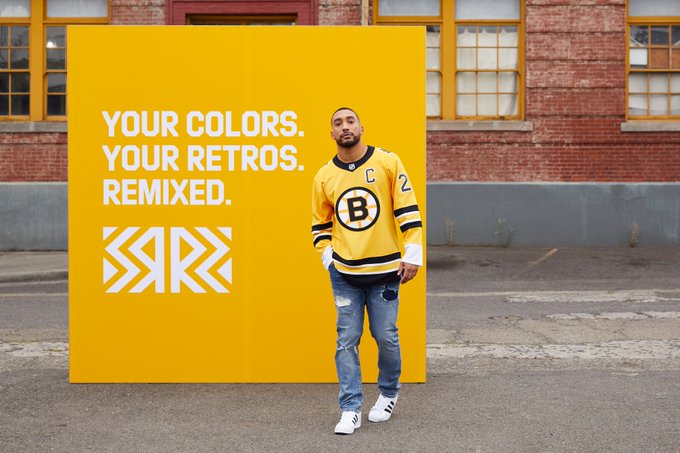
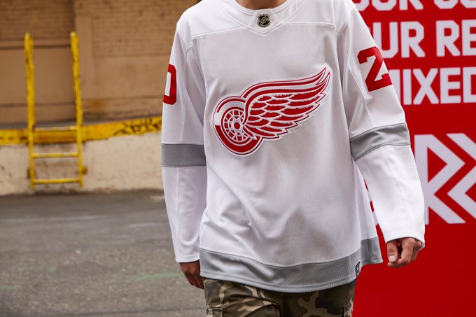
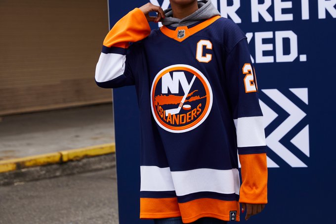
I like the Devils one but then some like the Islanders, Oilers and Sharks are just the jerseys they wear now more or less.

It's weird, some teams went and got weird with it and others like the Penguins are just wearing old jerseys of theirs.
 
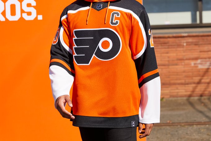
These are the worst ones:

Em89MrPXIAMOeNL

Em89S6vXYAI-0Ed

Em89jGlXEAASJJG

Em890BtWEAEvOuz

Em896ZOXcAAp1Ik


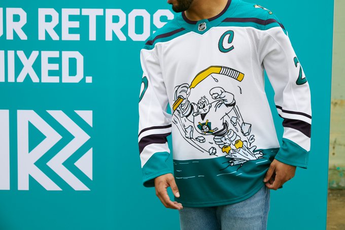
Anaheim's could have been amazing if they just used their classic ducks logo. What a failure.

The other ones were very clearly thrown together 3 hours ago.
 
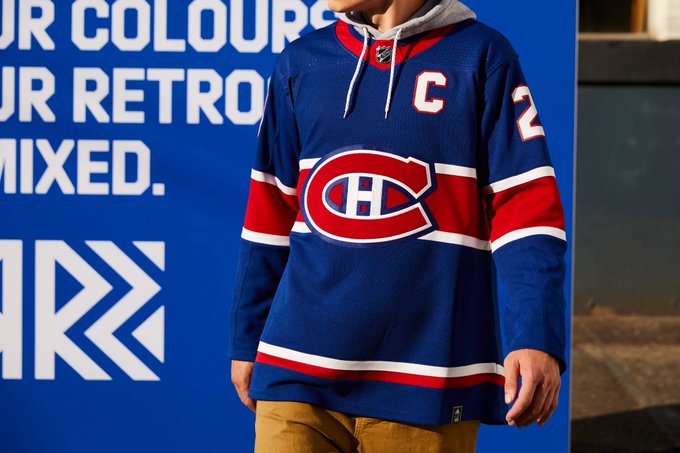
I meant to add Montreal's to the bad column:

Em89tKxXUAEoLdr


It's especially strange that all the original 6 ones are particularly lackluster. Toronto's is really the only one that leaned into the retro angle it seems. I guess in a way a lot of teams used up their best vintage-style jersey designs for the outdoor games.
 
terrible look, how bland... Argos also unveiled their updated Boat logo. At least they want back to the boat!! I hated those shields with the A. 
 
CarltonTheBear said:
These are probably the only good ones:
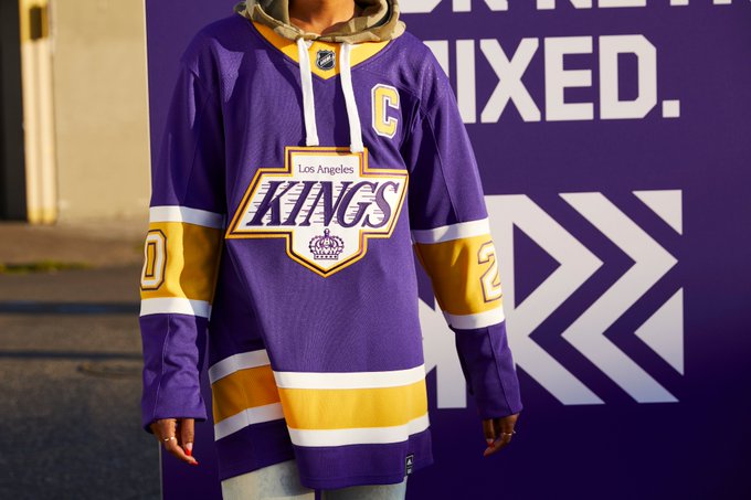
Em89YxZW4AApYKn

Em89crHXEAAeARK

Em89pc7XMAEn3kb


I copy and pasted 5 img codes before going through the logos and picking the good ones and I couldn't even use them all.

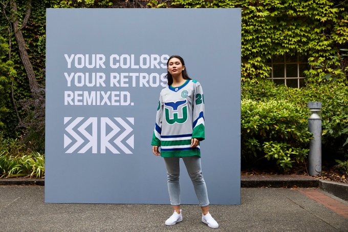
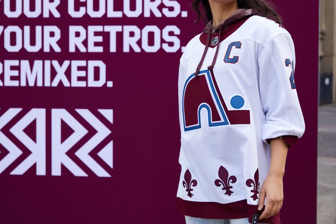
The Whale? The Nordique? 70's LA? Easy wins.
 
Arn said:
Why is the ?n? in ?Toronto? on the logo the only solitary letter in lower case?

Because designers in the past are just as bad as some designers in the present. lol. That's how it was on the original '67 logo.
 

About Us

This website is NOT associated with the Toronto Maple Leafs or the NHL.


It is operated by Rick Couchman and Jeff Lewis.
Back
Top